It was so inspiring to see all the work that had been created by the third years for their graduate show. I loved seeing what sort of work the students created when given such a broad brief and it was also so interesting to see how they had all chosen such different ideas showing that you could pretty much do anything you wanted. The outcomes were all so considered and looked so professional.
Most of the students had created business cards and cvs for people visiting to take if they wanted to contact them for future work. I loved the whole concept of the exhibition and the colours looked incredible. The theme of how we get from A-B with our ideas ran through the whole exhibition and the gifts we were given to hold all of our favourite pieces in worked so well.
I was really impressed with what the third years had created and I really hope my work will be up to this standard when I finish!
I have seen Alan Kitching’s work multiple times all around the country at different exhibitions. I am always amazed by how beautiful his prints look and the textures made from each layer of print. I love his use of placement and composition and how each layer creates such depth and shadow. The colours are contrasting and bright and the white background of each print makes sure the colours look as good as they possibly could.
Alan Kitching’s work is so inspirational and one of the reasons why I love printing so much. It’s so much more satisfying creating a multiple layer print that is time consuming and considered, and after seeing the end result you remember why it’s so much better than creating work on the computer. You can sense the amount of time and effort that has gone into each piece from the quality of the prints.
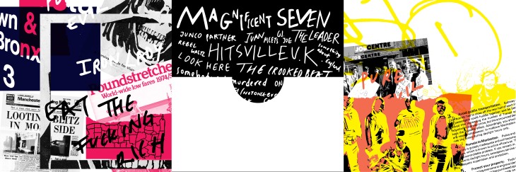
My inspiration for the album cover came from the different places where the band were situated whilst the album was being written: London, Manchester, New York and Jamaica. I wanted the cover to represent what was going on in all the different cities at the time the album was being produced. The album included three double sided vinyl records so the end product was a triple album where three 12″ records would fit.
To get inspiration for these posters, I sat in a cafe for a couple of hours and eavesdropped to different customer’s conversations. Most noise was overlapping each other so the idea behind these posters was the layers of talking, noise and laughter. I tried to convey the friendly sense of atmosphere I felt whilst sitting in this cafe.